Status: Design target. Not implemented. Recorded on 11 October 2026.
The style guide covers what ships today. This page records the rest of the agreed design so later work can build it without redoing the design exploration. The reference mockup is the workbench mockup (screenshot). All components reuse the tokens and rules in the style guide.
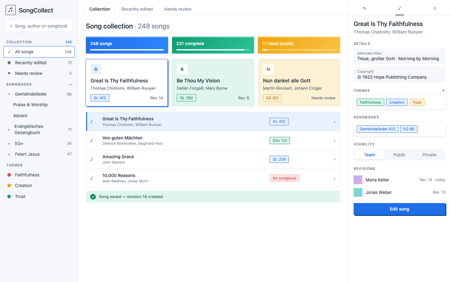
Nothing here changes the product requirements. Each piece lists the product capability it depends on; build the capability first, then the interface.
Layout: three panes🔗
| Pane | Width | Content |
|---|---|---|
| Navigation | 250px | Logo, search, views, songbook tree, theme list |
| Workspace | flexible | Tabs, page heading, stat tiles, song list |
| Details | 330px | Selected song: fields, badges, visibility, revisions, primary action |
The navigation pane uses --panel with a 1px right border. The details pane uses --bg with a 1px left border. The workspace uses --bg. All three scroll independently.
Below 1100px the details pane becomes a slide-over opened by selecting a song. Below 760px the navigation pane collapses to a menu button and the layout is a single column, as today.
Navigation tree🔗
Depends on: songbook records with an optional grouping, and per-songbook song counts.
- Search sits at the top: a 2px-radius input with the placeholder "Song, author or songbook".
- Section labels (
COLLECTION,SONGBOOKS,THEMES) use the 11px uppercase label style, in--muted; the+action beside a label is a quiet button, shown only to editors. - Rows are at least 44px tall (the style guide touch-target minimum) with an 18px icon column, the name and a right-aligned count in
--muted. Hover fills#fff. The selected row has a white fill and a 1.5px--accentoutline. - Songbooks form a tree. A parent shows a disclosure triangle (
▾open,▸closed) and its total count; children are indented 30px and show no count unless filtered. Keyboard: up and down move, right opens, left closes, Enter selects. Mark the treerole="tree"witharia-expandedandaria-selected. - Themes are a flat list. Each has a small coloured dot taken from the badge tones (blue, green, amber, repeating); the colour has no meaning.
- Selecting any row filters the song list and is reflected in the URL so views can be linked.
Saved views🔗
Depends on: persisted, per-church filter definitions, and a rule for "needs review".
- Fixed views at the top of the navigation: All songs, Recently edited and Needs review, each with a count. They also appear as tabs above the workspace; the active tab has a 1px border, a white fill and the
--accentlabel. - User-defined views are a later step. When added, they are a filter (text query, songbook, theme, status) plus a name, and appear under a
VIEWSsection with a+to save the current filter. - "Needs review" is proposed to mean a song missing required metadata (no authors, no songbook reference or no copyright). Confirm the definition with the product owner before building it.
Stat tiles🔗
Depends on: a summary endpoint returning counts for the current view.
Three tiles above the list, equal width, 8px gap:
| Tile | Fill | Meaning (proposed) |
|---|---|---|
| Songs | blue gradient #0d3f91 to #1a5fcf | Total songs in the view |
| Complete | green gradient #0b6e55 to #12805f | Songs with all required metadata |
| Need details | amber gradient #f0a30a to #f7c548 | Songs missing required metadata |
Each tile has a 3px double top rule in white at 85% opacity, 2px corners, white 15px label text and a 4px progress bar showing the share of the total. The tile is a label plus a count, not a button; it is not interactive in the first version. White text on the blue and green gradients meets AA (4.9:1 or better at the lightest endpoint); the amber gradient is too light for white, so use --ink text there (7:1 or better).
Song cards🔗
A grid alternative to the list, switchable from a view toggle in the workspace heading. Depends on nothing new.
Three columns, 14px gap, 2px corners, 1px --line border. Contents: avatar, title, authors, songbook badge and the revision number or "Needs review". The selected card gets a 1.5px --accent outline and the hard 3px 3px 0 --accent lift. Tinted fills (--success-soft, --accent-soft, --warning-soft) are optional and decorative only.
Details pane additions🔗
- Visibility toggle (Team, Public, Private): a three-segment control on
--panelwith the active segment white and--accenttext. Depends on per-song visibility in the data model, which the design does not yet define. Do not build before a decision records the visibility model. - Revisions list: the last revisions with author, revision number and relative date. Depends on a revision history endpoint. The author avatars are circles with a two-colour gradient generated from the user id.
- Primary action: one full-width "Edit song" primary button at the bottom, replacing the quiet button used today.
Notices🔗
The saved notice becomes a toast: the success bar from the style guide with a 18px green check mark circle at the left, shown at the bottom of the workspace and dismissed after five seconds. It keeps role="status".
Build order🔗
- Stat tiles and the "Needs review" definition (small, one endpoint).
- Navigation pane with the fixed views and the songbook tree.
- Song cards and the view toggle.
- Revisions list.
- Visibility, once its data model is decided.
- User-defined saved views.
Update the style guide's "Not part of this release" section as each piece ships.